It's the second of the month, and it occurs to me that even while 2 is my favorite number, it does not have a specific significance within the realm of Thursday. Coincidentally, today is the planned unveiling of the new Planism logo. Planism, Thursday, and 2, three of my favorite things. So: Happy Planist Thursday! Here's to many more~
You all know the old red-blue-and-yellow star-in-a-box symbol from the good ol' days, right? I have it on my computer and my laptop bag and my cdplayer and my phone. And I've drawn in on other things I want to mark as mine. Maybe I drew it on you once. In any case, this is what it looks like:
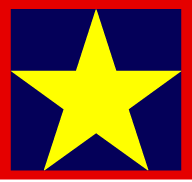
Here's what it means: The red border to represent the framework of communist thought surrounds the blue liberty. And the yellow star of Planism holds it all together. The star itself is a tribute to communism as well as a slight on America (whose stars are white). And together, the primary colors represent the basics that work.
And while Planism hasn't changed (although in theory is should be growing), it's time for that symbol to change. To become better. Thus, through thought and inspiration, I have come to this. Behold! The new face of Planism!

How do you like? The colors have the same meanings, but the shapes mean more. The most important part is the change from star to triangle as the basic shape of Planism. Why triangle? Well, my first response is Why star? The star was just an homage to communism, which is kinda redundant with the red border. But the triangle is the most solid shape, in terms of structure and physics and stuff. It's also my favorite shape!
Also, consider this. Fact: the human hand has three triangles. Fact: yellow is invisible. Therefore, if the triangles are yellow, then that's why you can't see them.
trapezoids are my second favorite shape, since I wrote that haiku about them. Since then, my fondness for them has grown because I realized they were just squares who were striving to become more triangle-like. That's a noble goal, let me tell you. So the shape of the logo's border has changed from square to trapezoid, to represent the transformation of communism towards Planism. Also, it's a break in convention, which we all appreciate, if you consider that our logo is supposed to also be what we display on flags. I've never seen a trapezoidal flag, have you? The square was a step in that direction, but now we've gone a step farther. Also, there was this minor inconvenience where the US army uses a star inside a bordered box as their logo. Now, all confusion has been cleared.
Talking about use, in the commune these will be worn as badges. As of now, they're just stickers, you know. Work is still being done on advanced designs, to designate rank. So far, they're taller and the triangles are snazzier, but instead of perfecting them, I decided to do homework.
So, in real-world news, I should be looking up stuff about Oprah and finishing the website for our presentation. Ew. I also need to scan some stuff from her magazine. Then I need to write a write-up about our last filming project.
OH. This morning in lab we messed around with "live" production--switching video and audio while the action is running, like a news show. But it was just Batman telling Robin not to fall for Poison Ivy, and then she tries to break into the BatCave. I ran the switcher, following the director's....directions....bringing which camera or graphic up onto the screen which in practice would go to tape or to air. Then I ran the audio board, bringing in the talents' mics when needed, and fading in and down and up and out the music when needed. And then I taught my friends how to do it! It was actually one of the better labs in a while, because we got to do something. When we first walked into the secret control room, all the equipment and monitors and wires and buttons and dials and sliders and lights looked incredibly daunting, but it was a good introduction.
Well, I'd best be off to working, and probably also eating. Lost next week had better be better than this week, and I'm still looking forward to the Office. Yayayayayayan.
-Steph
No comments:
Post a Comment